When you’re designing a flyer, postcard, brochure or other printed piece, there are three areas worth understanding:
Bleed. Trim. Safe Area.
They each serve a different purpose, but the basic idea is easy to remember:
Backgrounds go OUT. Important information stays IN.
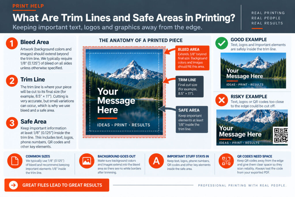
The trim line represents the finished edge of your printed piece.
If you’re ordering an 8.5″ × 11″ flyer, for example, the trim line represents the final 8.5″ × 11″ size after the piece has been cut.
Commercial printing and finishing equipment is very accurate, but cutting isn’t infinitely precise. There can be small variations from sheet to sheet during production.
That’s why we use both bleed outside the trim and a safe area inside it.
The safe area is the space inside the trim line where important information should be kept.
This includes things like:
At SIG-1, we generally recommend keeping important elements at least 1/8″ (.125″) inside the trim line, unless your project requires something different.
Giving these elements a little breathing room helps protect them from normal trimming variation and usually makes the design look better too.
This is probably the easiest way to remember the entire concept:
BLEED → OUTSIDE THE TRIM
Background colors, photographs and graphics that are supposed to run all the way to the edge should
extend beyond the trim line into the bleed area.
SAFE AREA → INSIDE THE TRIM
Text, logos, QR codes and other important information should stay comfortably inside the trim line. The trim line sits between the two.
Technically, you sometimes can.
But unless the design intentionally calls for it, putting important text extremely close to the finished edge creates unnecessary risk.
A small variation during trimming could make the margin look uneven—or in an extreme case, trim into the information itself.
Even when nothing gets cut off, text sitting too close to the edge can make a design feel cramped. A little extra room is usually your friend.
Borders can be surprisingly unforgiving.
If you place a thin rectangular border very close to the trim line, even a tiny amount of cutting variation can make the border appear uneven.
One side might look slightly wider than another even though the piece was trimmed within normal production tolerances.
If your design uses a border, we recommend positioning it comfortably inside the finished edge rather than directly next to the trim line.
QR codes should not be placed right against the edge of your design.
In addition to keeping them safely inside the trim, QR codes require clear space around the code itself so phones can recognize and scan them reliably.
Don’t crowd a QR code with text, photographs or other graphics.
And before submitting your file, scan the QR code from the actual exported PDF to make sure it goes where you expect.
If you’re designing in Canva, you can display Canva’s print bleed guides to help understand where the finished edge will be.
Background images and colors intended to reach the edge should extend through the bleed area.
Then move important text and graphics in the opposite direction—toward the inside of the page.
If you’re unsure, give important elements a little more room rather than a little less.
That’s okay.
Good design sometimes intentionally places type, photographs or other elements near or across an edge.
These guidelines aren’t meant to limit your creativity.
The important thing is understanding where the piece will be trimmed and what could happen if production varies slightly.
Once you understand that, you can make an informed design decision.
Send us your file.
At SIG-1, we’ll look at your artwork in the context of how the job will actually be printed and finished.
If we see text, logos or other important elements sitting dangerously close to the trim, we’d rather point it out before production.
SIG-1 Graphics
Professional printing with real people looking at your files.
Sacramento, California

Combining old world artisan craftsmanship with cutting edge technology, Sig-1 exerts a visual mastery over every printed document and image it produces. Sig-1’s failsafe printing methods offer meticulous attention to detail, high touch personal service, served with a creative and quirky style that turns every print job into a delightful experience.

