You’ve created your design.
Everything looks perfect on your computer.
Then you send the file somewhere else and suddenly:
What happened?
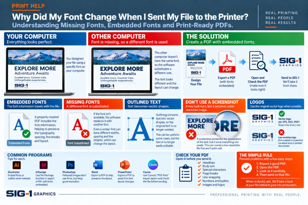
Most likely, the other computer doesn’t have the same font—or the font wasn’t properly included with thefile.
Fortunately, this is usually easy to prevent.
Fonts are software.
When you use a particular typeface in a document, your computer uses the font files installed on your system to display those characters.
If you send an editable document to another computer that doesn’t have that font available, the software may substitute another font.
And even a seemingly similar replacement font can have different:
That can change the entire layout.
Imagine a headline that fits perfectly on one line.
If another font is substituted and its characters are slightly wider, the final word may move onto a second line.
That can push everything below it downward.
In a brochure, booklet or tightly designed page, one missing font can create changes throughout the document.
That’s why font problems aren’t just about typography.
They can become layout problems.
One of the reasons PDF is such a useful format for professional printing is that fonts can generally be embedded within the PDF.
Embedding means the information needed to reproduce the typeface travels with the document.
That helps preserve:
even when the receiving computer doesn’t have the original font installed.
This is one reason SIG-1 generally recommends supplying a properly prepared PDF for finished artwork.
Not necessarily.
Most professional PDF-export workflows can embed fonts, but embedding depends on the software, export settings and the licensing permissions built into the font itself.
Some fonts may have restrictions that prevent normal embedding.
So simply seeing “.pdf” at the end of the filename doesn’t automatically guarantee that every font is embedded correctly.
You may sometimes hear a printer or designer say:
“Convert the type to outlines.”
Outlining converts the characters from editable text into vector shapes.
Once outlined, the receiving computer no longer needs the original font to draw those letters.
This can be useful in certain production workflows, particularly with logos, signs and other finished graphics.
But there is a tradeoff.
Once text has been converted to outlines, it’s no longer easily editable as normal text.
That’s why outlining everything isn’t always the best solution.
Should I Outline All My Fonts Before Sending a File?
Usually, not automatically.
For most finished documents, a properly created PDF with embedded fonts is a better general workflow.
Outlining can be useful when:
For a 40-page booklet containing thousands of words, converting every character to outlines usually isn’tnecessary if the PDF is properly prepared.
That’s different.
If you’re sending an editable file from software such as Adobe InDesign or Illustrator, SIG-1 may need access to the fonts and linked graphics used in the document.
Professional design applications often include a Package function that gathers the document, linked images and fonts permitted for packaging.
If we ask for native files, ask us what we need.
Don’t assume the design file by itself contains everything required to reproduce the project.
Canva generally handles its own fonts within the Canva environment.
When you’re sending a finished Canva project for professional printing, exporting a PDF Print file is normally much safer than trying to recreate the design in another program.
The exported PDF preserves the layout far more reliably than screenshots or copying individual elements into another application.
Open the exported PDF before sending it and make sure the typography looks exactly as you expect.
These programs can create perfectly usable content, but editable Office documents can be more vulnerable to layout changes when opened on another computer.
Different:
can sometimes affect the appearance of the document.
If the design is finished, creating a high-quality PDF can help lock the layout into the form you intended.
A screenshot may preserve the appearance of the text, but it turns the entire design into pixels.
That can create a completely different problem:
low resolution.
Instead of solving one file-preparation issue by creating another, generate a proper PDF or ask us for help.
If your logo contains typography, the original vector logo file is usually preferable.
Professional logo artwork is often supplied with the lettering already converted to vector shapes, which eliminates dependency on the original font.
That’s one reason an original AI, EPS, SVG or vector PDF logo is usually much better than a JPEG copied from a website.
The simplest first step is:
Open it.
Don’t assume that because the PDF exported successfully, everything is correct.
Look at:
Compare the PDF to your original design.
If anything changed, don’t send it until you understand why.
For most finished artwork:
A properly prepared PDF is usually the best starting point.
If we need native files, fonts, linked graphics or something else, we’ll let you know.
And if you’re worried about a particular typeface, tell us.
We’ll look at the file before it goes into production.
If your design is finished and looks exactly the way you want it:
That simple habit prevents a surprising number of printing problems.
SIG-1 Graphics
Professional printing with real people looking at your files.
Sacramento, California

Combining old world artisan craftsmanship with cutting edge technology, Sig-1 exerts a visual mastery over every printed document and image it produces. Sig-1’s failsafe printing methods offer meticulous attention to detail, high touch personal service, served with a creative and quirky style that turns every print job into a delightful experience.

