You’ve designed something on your computer and the colors look fantastic.
Then you see the printed piece and think:
“Why doesn’t that color look exactly like it did on my screen?”
This is one of the most common questions we hear in professional printing, and there’s a good reason for it. Your screen and a printing press create color in completely different ways.
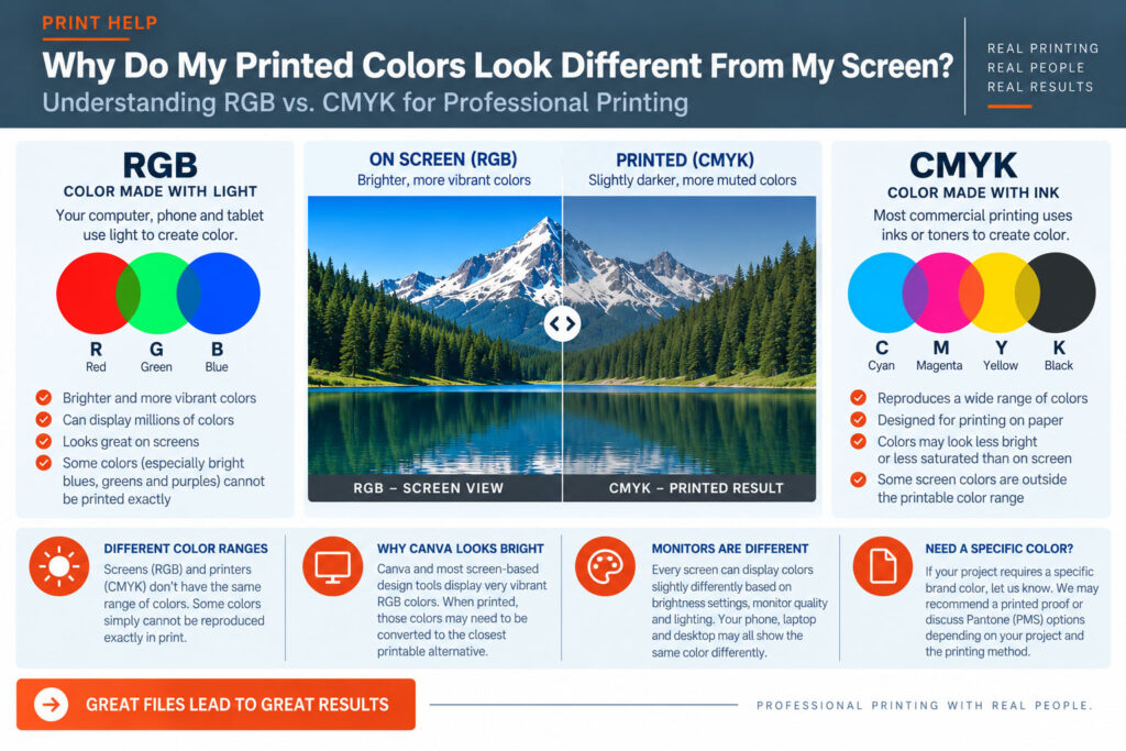
Computer monitors, phones and tablets create color using light.
They combine:
R — Red
G — Green
B — Blue
This is called RGB color.
Because screens are actually producing light, they can display some extremely bright and vibrant colors—
particularly intense blues, greens, purples and other highly saturated colors.
Most commercial color printing creates color using inks or toners rather than light.
The four primary printing colors are:
C — Cyan
M — Magenta
Y — Yellow
K — Black
This is called CMYK color.
Different percentages of these four colors are combined to reproduce photographs, illustrations and other colors on the printed page.
RGB and CMYK don’t have exactly the same range of colors.
Some colors that can be produced by glowing pixels on a screen simply cannot be reproduced exactly using cyan, magenta, yellow and black on paper.
When an RGB color falls outside the range that can be reproduced in CMYK, it has to be converted to the closest printable alternative.
That can cause some colors to appear:
This doesn’t necessarily mean anything went wrong with your file or the printing.
Sometimes you’re simply seeing the difference between color made with light and color made with ink or toner.
Canva—and most software designed primarily for screens—can display very bright RGB colors. Those colors can look especially vibrant on a modern phone, tablet or computer monitor.
When the design is prepared for professional printing, some of those colors may need to be reproduced within the available printable color range.
Extremely bright blues, greens and other highly saturated colors are often where customers notice the biggest difference.
No.
Even before we get to printing, two computer monitors can display the same file differently.
Brightness settings, monitor quality, display calibration, ambient lighting and even the type of screen can affect what you’re seeing.
Your phone, laptop and desktop monitor may all display the same color slightly differently.
That’s another reason a computer screen should not be considered an exact representation of printed color.
If your project contains a specific corporate color or another color that needs to reproduce consistently, let us know.
Don’t rely solely on what the color looks like on your computer monitor.
Depending on the project, we may recommend reviewing a printed proof or discussing other color options before the full job is produced.
Some projects use specially specified colors, commonly referred to as Pantone or PMS colors.
These can be useful when consistent brand-color reproduction is particularly important.
However, not every printing process reproduces Pantone colors as individually mixed inks. Some digital printing systems simulate those colors using CMYK or additional toner colors.
If your project requires a particular Pantone color, tell us when requesting your quote so we can determine the appropriate production method.
You generally don’t need to become a color-management expert just to send us a Canva file.
Prepare the best-quality file you can, export it using PDF Print, and send us the PDF.
If we see something that may create a significant printing issue, we’ll let you know.
The most important thing is understanding that a glowing computer screen and ink or toner on paper will never behave exactly the same way.
Send us your file.
If color reproduction is especially important to your project, tell us before we print it.
At SIG-1, an experienced person can look at your file, your project and the way it will be produced and help you determine whether there are potential color concerns.
That’s one of the advantages of working with a professional printer instead of simply uploading a file and hoping for the best.
SIG-1 Graphics
Professional printing with real people looking at your files.
Sacramento, California

Combining old world artisan craftsmanship with cutting edge technology, Sig-1 exerts a visual mastery over every printed document and image it produces. Sig-1’s failsafe printing methods offer meticulous attention to detail, high touch personal service, served with a creative and quirky style that turns every print job into a delightful experience.

